本文将介绍几种经典的网页布局。
一、居中
1.文本水平居中
通过在其父元素中设置 text-align: center 可以使文本水平居中。
2.文本垂直居中
通过将文本的 line-height 设置为其父元素的高度,从而实现。
3.块级元素水平居中
要使块级元素水平居中,可以先为元素设置宽度,再设置 margin: auto 实现。
为其设置宽度后,浏览器会计算剩余宽度,并平均分配给左右外边距。
1
2
3
4
| 选择器 {
margin: auto;
width: 宽度;
}
|
4.块级元素垂直居中
- 将元素的 position 设为 absolute ,然后将 top、right、bottom、left设为 0 (即元素的各边到包含块的各边之间距离为 0 ),使元素撑满整个空间
- 设置元素的宽度和高度
- 设置
margin: auto
1
2
3
4
5
6
7
8
9
10
| 选择器 {
width: 宽度;
height: 高度;
position: absolute;
top: 0;
right: 0;
bottom: 0;
left: 0;
margin: auto;
}
|
5.利用平移居中
- 通过绝对定位使元素的左上角位于父元素中点处
- transform: translate(x,y) 用于水平位移
- 因为 x y 属性中的百分比是以元素的尺寸为准,因此直接设为 50% 即可,元素将移动半个它大小的位置
1
2
3
4
5
6
7
8
| .login {
width: 宽度;
height: 高度;
position: absolute;
left: 50%;
top: 50%;
transform: translate(-50%, -50%);
}
|
6.利用负外边距居中
- 通过绝对定位使元素的左上角位于父元素中点处
- 通过负外边距调整元素位置
- 因为外边距中的百分比是以父元素的尺寸为准,因此不可以直接用百分比
- 用元素尺寸的一半来调整元素位置
1
2
3
4
5
| position: absolute;
left: 50%;
top: 50%;
margin-left: - 元素宽度/2;
margin-top: - 元素高度/2;
|
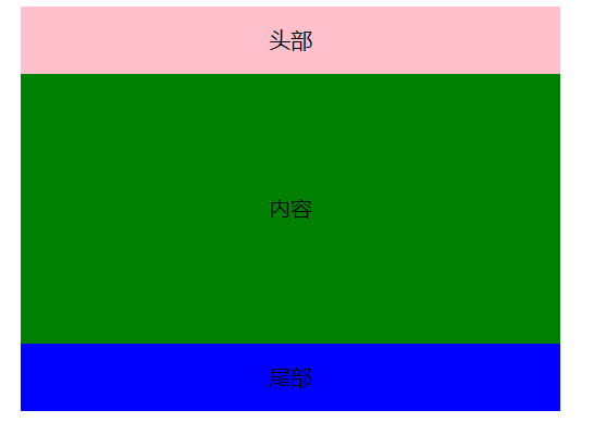
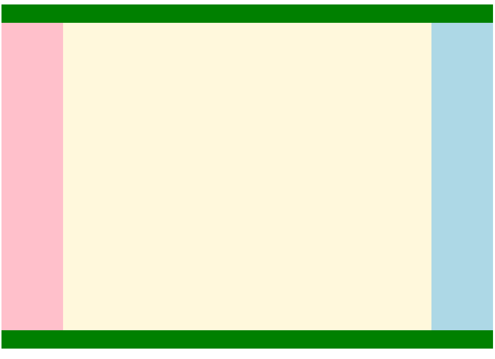
二、单列布局
示例:
1
2
3
4
5
6
7
8
9
10
11
12
13
14
15
16
17
18
19
20
21
22
23
24
| header, main, footer {
max-width: 1024px;
margin: 0 auto;
text-align: center;
}
header {
height: 50px;
line-height: 50px;
background-color: pink;
}
main {
height: 200px;
line-height: 200px;
background-color: green;
}
footer {
height: 50px;
line-height: 50px;
background-color: blue;
}
<header>头部</header>
<main>内容</main>
<footer>尾部</footer>
|
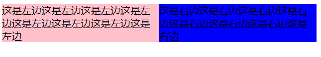
三、两列布局
1.两列固定宽度且居中
1
2
3
4
5
6
7
8
9
10
11
12
13
14
15
16
17
18
19
20
21
| .container {
max-width: 1024px;
margin: 0 auto;
}
.left {
width: 50%;
background-color: pink;
float: left;
}
.right {
width: 50%;
background-color: blue;
float: left;
}
<div class="container">
<div class="left">这是左边这是左边这是左边这是左边这是左边这是左边这是左边这是左边</div>
<div class="right">这是右边这是右边这是右边这是右边这是右边这是右边这是右边这是右边</div>
</div>
|
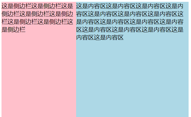
2.侧边栏固定宽度,主内容自适应
通过浮动实现:
aside 设置了左外边距,用于避开浮动元素,防止被覆盖。
1
2
3
4
5
6
7
8
9
10
11
12
13
14
15
| aside {
width: 200px;
height: 500px;
background-color: pink;
float: left;
}
main {
height: 500px;
margin-left: 200px;
background-color: lightblue;
}
<aside>这是侧边栏这是侧边栏这是侧边栏这是侧边栏这是侧边栏这是侧边栏这是侧边栏这是侧边栏</aside>
<main>这是内容区这是内容区这是内容区这是内容区这是内容区这是内容区这是内容区这是内容区这是内容区这是内容区这是内容区这是内容区这是内容区这是内容区这是内容区这是内容区</main>
|
通过 position 实现:
1
2
3
4
5
6
7
8
9
10
11
12
13
14
15
16
17
18
19
20
21
22
| aside {
width: 200px;
height: 500px;
background-color: pink;
position: absolute;
top: 0;
left: 0;
}
main {
height: 500px;
margin-left: 200px;
background-color: lightblue;
}
div {
position: relative;
}
<div>
<aside>这是侧边栏这是侧边栏这是侧边栏这是侧边栏这是侧边栏这是侧边栏这是侧边栏这是侧边栏</aside>
<main>这是内容区这是内容区这是内容区这是内容区这是内容区这是内容区这是内容区这是内容区这是内容区这是内容区这是内容区这是内容区这是内容区这是内容区这是内容区这是内容区</main>
</div>
|
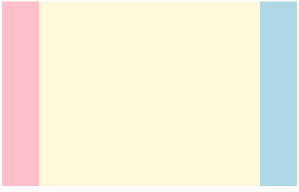
四、三列布局
1.左右浮动,中间避开
左右两列设置为浮动;中间列设置左右外边距以防被覆盖。
需要注意的是:
- HTML 文件内,中间列应该放置在最后
- 中间列不应指定宽度,宽度应该自适应
2.绝对定位法
将左右两列设为决定定位,固定在两侧;中间列设置左右边距。
3.外边距负值法1
- 这里中间列设为两层的目的是:
- 中间列需要占满一整个宽度,使左右列可以通过负外边距的方式归位
- 通过设置为两层,内层可以通过设置外边距的方式避开左右列
- 最外层设置为 100% 宽度,并左浮动
- 中间列:设置左右边距为左右栏留下空间,中间列宽度不指定,为自适应
- 左栏:设为左悬浮,并设置外边距为 100%(即父对象宽度的 100%)。左栏将会向左移动,本来应该在整个页面的右边,因超出边界而被换行,移动后将移至最左边。
- 右栏:设为做悬浮,并设置外边距为负的栏宽。右栏将会向左移动一个栏宽,刚好位于右侧。
1
2
3
4
5
6
7
8
9
10
11
12
13
14
15
16
17
18
19
20
21
22
23
24
25
26
27
28
29
| .container {
width: 100%;
float: left;
}
.center {
height: 500px;
margin: 0 100px;
background-color: cornsilk;
}
.left {
width: 100px;
height: 500px;
float: left;
margin-left: -100%;
background-color: pink;
}
.right {
width: 100px;
height: 500px;
float: left;
margin-left: -100px;
background-color: lightblue;
}
<div class="container">
<div class="center"></div>
</div>
<div class="left"></div>
<div class="right"></div>
|
4.外边距负值法2
与法 1 的区别在于:
- 中间列不再设为两层
- 中间列:设置为左浮动,横向占据 100%,设置 box-sizing 值,通过内边距的方式避开左右列
1
2
3
4
5
6
7
8
9
10
11
12
13
14
15
16
17
18
19
20
21
22
23
24
25
26
| .center {
box-sizing: border-box;
padding: 0 100px;
float: left;
width: 100%;
height: 500px;
background-color: cornsilk;
}
.left {
width: 100px;
height: 500px;
float: left;
margin-left: -100%;
background-color: pink;
}
.right {
width: 100px;
height: 500px;
float: left;
margin-left: -100px;
background-color: lightblue;
}
<div class="center"></div>
<div class="left"></div>
<div class="right"></div>
|
5.双飞翼布局
与外边距负值法相比,增加了顶栏和底栏,并将三列都包裹到 main 中。
1
2
3
4
5
6
7
8
9
10
11
12
13
14
15
16
17
18
19
20
21
22
23
24
25
26
27
28
29
30
31
32
33
34
35
36
37
38
39
40
41
42
43
44
45
46
47
48
| <style>
header {
width: 100%;
height: 30px;
background-color: green;
}
main {
overflow:hidden;
}
footer {
width: 100%;
height: 30px;
background-color: green;
}
.container {
width: 100%;
float: left;
}
.center {
height: 500px;
margin: 0 100px;
background-color: cornsilk;
}
.left {
width: 100px;
height: 500px;
float: left;
margin-left: -100%;
background-color: pink;
}
.right {
width: 100px;
height: 500px;
float: left;
margin-left: -100px;
background-color: lightblue;
}
</style>
<header></header>
<main>
<div class="container">
<div class="center"></div>
</div>
<div class="left"></div>
<div class="right"></div>
</main>
<footer></footer>
|
6.圣杯布局
- 在 main 中设置内边距,以帮助中间栏避开左右栏
- 通过类选择器,为三个栏设置左浮动
- 中间栏首先浮动,它会占据整个屏幕
- 左边栏第二个浮动,它本应处在第二行的首位(这里的首位仍然距离页面左侧 100px ,因为父元素设置了内边距);通过负外边距 -100% 使其上移;上移后仍会距离页面左侧 100px,因此通过相对布局使其移动到合适的位置。
- 右边栏第三个浮动,它本应处在第二行的首位;通过负外边距使其左移一个栏宽,从而移动到合适的位置。
- 底栏,因为 main 部分都设置了浮动,脱离了文档流,因此如果不做任何处理的话,底栏将会紧挨着顶栏,而被 main 覆盖。因此有以下解决办法:
- 通过 position 设置相对移动,但文字仍会环绕浮动元素
- 通过
clear: both 清除浮动
1
2
3
4
5
6
7
8
9
10
11
12
13
14
15
16
17
18
19
20
21
22
23
24
25
26
27
28
29
30
31
32
33
34
35
36
37
38
39
40
41
42
| header {
height: 30px;
background-color: green;
}
main {
padding: 0 100px;
}
footer {
height: 30px;
background-color: green;
clear: both;
}
.column {
float: left;
}
#center {
width: 100%;
height: 500px;
background-color: cornsilk;
}
#left {
width: 100px;
height: 500px;
margin-left: -100%;
position: relative;
right: 100px;
background-color: pink;
}
#right {
width: 100px;
height: 500px;
margin-right: -100px;
background-color: lightblue;
}
<header></header>
<main>
<div id="center" class="column">fsfsfsf</div>
<div id="left" class="column"></div>
<div id="right" class="column"></div>
</main>
<footer></footer>
|
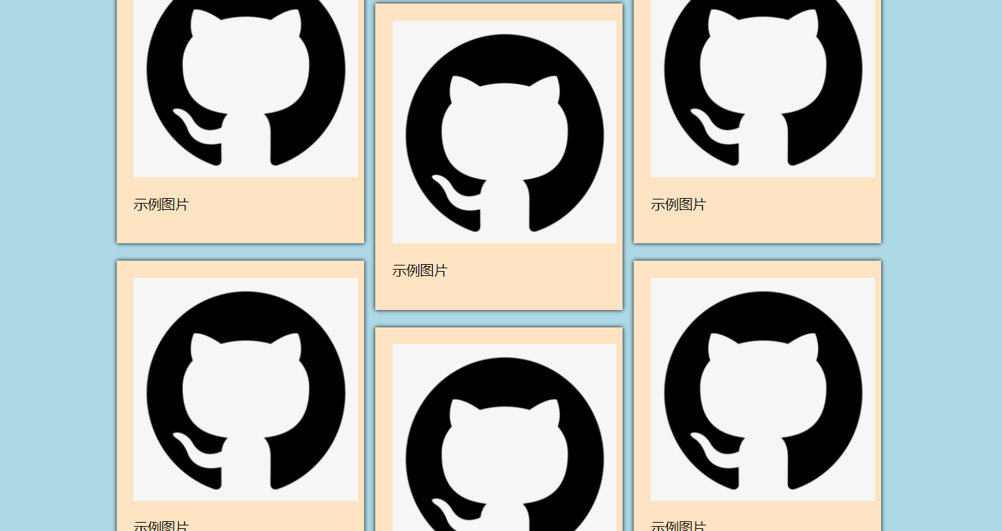
五、瀑布流布局
为父元素 page 设置最大宽度,设置 margin 使其居中
在 col 中设置 column 属性,将内容分为三列
在每一个内容格 pic 中,设置内边距、外边距、阴影等属性
在 pic 的 img 中,设置其宽度,使整个网页更加协调
1
2
3
4
5
6
7
8
9
10
11
12
13
14
15
16
17
18
19
20
21
22
23
24
25
26
27
28
29
30
31
32
| body {
background-color: lightblue;
margin: 10px;
}
#page {
width: 888px;
margin: 0 auto;
}
.col {
column-count: 3;
column-gap: 13px;
column-fill: balance;
}
.pic {
background-color: bisque;
padding: 20px;
margin-bottom: 20px;
box-shadow: 0 0 5px black;
}
.pic img {
width: 260px;
}
<div id="page">
<div class="col">
<div class="pic">
<img src="https://gitee.com/codewld/img/raw/master/img/20210414001.png">
<p>示例图片</p>
</div>
···
</div>
</div>
|
参考